
피그마 디자인을 보자


1. 사이즈를 lg, md, sm 세가지로 나눔
2. 버튼이 하얀버튼과 주황버튼 두가지로 나뉨
3. 폰트 관련 사양은 다 똑같음
무지한 상태에서 무지성 컴포넌트 생성한 코드
import { Button } from '@chakra-ui/react';

interface SubmitButtonType {
  variant: string;
  title: string;
  sizes?: string;
  w?: string;
  mt?: string;
  mb?: string;
  isDisabled?: boolean;
  type?: string;
  onClick?: () => void;
}

export const SubmitButton = (props: SubmitButtonType) => {
  const {
    title,
    variant,
    isDisabled = false,
    sizes,
    mt,
    mb,
    w,
    onClick,
    type = 'submit',
  } = props;
  return (
    <>
      <Button
        w={w}
        mt={mt}
        mb={mb}
        type={type !== 'submit' ? 'button' : 'submit'}
        borderRadius="100px"
        border="1px"
        fontSize="16px"
        fontWeight="bold"
        variant={variant}
        size={sizes}
        isDisabled={isDisabled}
        onClick={onClick}
      >
        {title}
      </Button>
    </>
  );
};
차크라에 대한 숙지가 좀 많이 없는 상태에서 저 버튼을 컴포넌트화해서 사용하려다 보니까, 위 코드처럼 단순히 프롭스를 넘겨받아서 버튼 컴포넌트에 overwrite를 해주는 식으로 했는데 왜 이렇게 했냐면, 명시적으로 SubmitButton이라는 컴포넌트 만들어서 딱 봤을때 어떤 용도 인지 알 수 있도록 하고싶었다. 하지만 이렇게 하면 어떤걸 넘겨주어야하는지 하나하나 늘려가야 했었고 타입지정도 다 하나씩 해주어야했었다. 그러다가 차크라 자체적으로 컴포넌트에 대한 Props를 제공해준다는 것을 알게됬는데 내가 정말 잘못 사용하고 있다는 걸 알게되었다. 사용법은 간단했다.
import { Button, ButtonProps } from '@chakra-ui/react';

interface SubmitButtonType extends ButtonProps {}

export const SubmitButton = ({ ...props }: SubmitButtonType) => {
  const { title, variant, isDisabled = false, size } = props;
  return (
    <>
      <Button
        borderRadius="100px"
        border="1px"
        fontSize="16px"
        fontWeight="bold"
        variant={variant}
        size={size}
        isDisabled={isDisabled}
        {...props}
      >
        {title}
      </Button>
    </>
  );
};
컴포넌트에 해당 컴포넌트 Props 적용법
1. ButtonProps를 import를 해온다.
2. 컴포넌트 타입에 extends를 해준다.
3. 타입지정을 해준다.
4. 컴포넌트에 { ...props }를 넘겨준다.
5. 넘겨받은 props들이 알아서 적용된다. ( ButtonProps에 등록된 애들 한에서 )
코드보면 variant랑 size라는 속성이 있는데, 다른 컴포넌트 프레임워크에서도 지원하는지는 모르겠으나,
내가 원하는 스타일을 먼저 정의해놓고, 식별자로 만들어서 쓸수가 있는 속성이다. 밑에 설명이 봐보자
https://chakra-ui.com/docs/styled-system/component-style
Chakra UI - A simple, modular and accessible component library that gives you the building blocks you need to build your React a
Simple, Modular and Accessible UI Components for your React Applications. Built with Styled System
chakra-ui.com
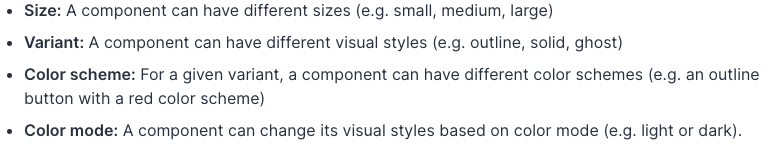
- size: 컴포넌트가 다른 사이즈들을 가질 수 있게한다 ( 예 - small, medium, large )
- variant: 컴포넌트가 다른 비주얼적 스타일들을 가질 수 있게한다. ( 예 - outlinem solid, ghost )
- color scheme: 제공된 variant로, 한 컴포넌트가 다른 color schemes들을 가질 수 있게 해준다.
( 예 - 빨강 color scheme을 가진 아웃라인 버튼 )
- color mode: color Mode에 따른 비주얼 스타일을 변경할 수 있게한다.
나는 여기서 variant, size를 퍼블리싱 전반에 걸쳐서 많이 사용하게 됬는데, 차크라에서는 이를 컴포넌트에서 설정해서 사용할 수 있다.
export default {
  // 기본 스타일
  baseStyle: {},
  // 사이즈 변수화를 위한 스타일
  sizes: {},
  // 시작적 스타일 변수화를 위한 스타일
  variants: {},
  // Default size와 variant를 지정하는 스타일
  defaultProps: {},
}
내가 만든 Button.ts의 variant와 sizes 는 이렇다.
variants: {
    btncommerse: {
      bg: 'commerse.500',
      color: 'white',
      _hover: {
        transform: 'scale(1.02)',
        _disabled: {
          transform: 'scale(1.00)',
          bg: 'commerse.500',
        },
      },
    },
    btnwhite: {
      bg: 'white',
      color: 'commerse.500',
      _hover: {
        transform: 'scale(1.02)',
        _disabled: {
          transform: 'scale(1.00)',
          bg: 'white',
        },
      },
    },
    btntoggle: {
      bg: 'white',
      color: 'gray.600',
      fontWeight: '400',
      fontSize: '16px',
      h: 'auto',
      _hover: {
        fontWeight: 'bold',
        color: 'commerse.500',
      },
    },
  },
  sizes: {
    btnsm: {
      w: '150px',
      h: '50px',
      fontSize: '16px',
      fontWeight: 'bold',
      mb: '30px',
    },
    btnmd: {
      w: '190px',
      h: '50px',
      fontSize: '16px',
      fontWeight: 'bold',
      mb: '30px',
    },
    btnlg: {
      w: '100%',
      h: '50px',
      fontSize: '16px',
      fontWeight: 'bold',
      mb: '50px',
    },
  },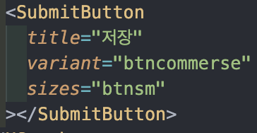
컴포넌트 선언할때 이런식으로 나오게 된다.
결론
근데 생각해보니까 컴포넌트로 안만들고 다 variant size만 써서 만들 수 있었을거같단 생각은 들지만 원조 Button 그 자체는 안건들이는게 맞다 생각을 한다. 더 좋은 방법이 있을거같은데 이게 내 지식선의 한계다.. 그냥 파면 팔수록 코드가 줄고 편할거 같은데 처음써보는거라 ㅎㅎ ;;;
'Project > 인코스런' 카테고리의 다른 글
| JWT 토큰 Refresh 하기 feat. Axios (0) | 2022.10.11 |
|---|---|
| 배송지 주소 검색 모달을 구현해보자.. (0) | 2022.10.07 |
| 시작부터... RTK로 햇으면 좋았을 것을.. (0) | 2022.10.05 |
| Did you mean to use React.forwardRef()? Nope (0) | 2022.10.03 |
| 클릭해서 스크롤 이동하기 ! ( click to scroll ) (0) | 2022.10.02 |